Proxema is a simplified management experience built on top of WordPress, designed to make everyday website and store operations easier for non-technical users. Instead of navigating through the traditional WordPress admin, users get a focused interface for managing the things that matter to their business.
My role was to translate product requirements and existing WordPress capabilities into an interface that felt simpler, more consistent and easier to operate across desktop and mobile.
ROLE
Product Designer
PLATFORM
Web & Mobile App
TOOLS
Figma, Claude, Notion
YEAR
2025 - 2026

Proxema onboarding experience
The problem
WordPress and WooCommerce can handle a huge range of business operations, but that flexibility also introduces complexity. Managing orders, products, customers, coupons, reports and store settings often means navigating between different pages, plugins and interfaces.
The challenge with Proxema wasn't to recreate everything WordPress already offered.
It was to decide what users actually needed in their day-to-day workflow and bring those actions forward, while keeping the underlying complexity out of the way.
The product needed to remain powerful enough for real store management, but approachable enough that someone shouldn't need to understand WordPress to use it.
The design goal: Reduce the effort required to manage a WordPress store without reducing the control users have over it.
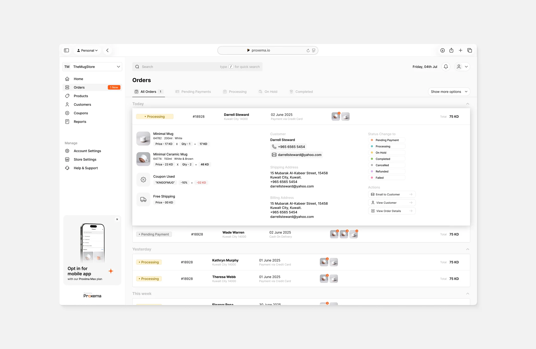
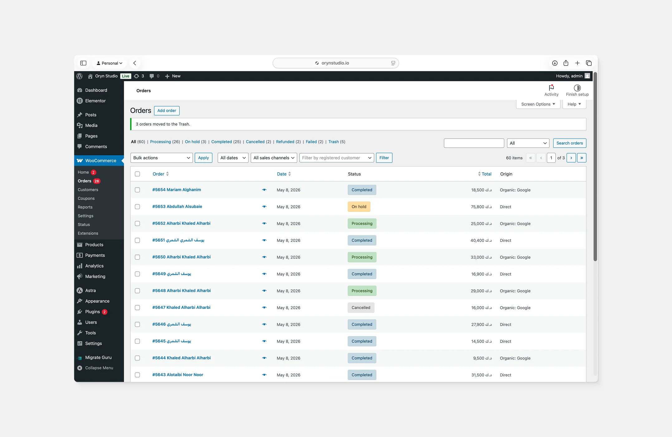
WordPress admin vs. Proxema Comparison
My Approach
Proxema was developed in a fast-moving environment where features needed to move from requirements to development quickly. Instead of following a long, documentation-heavy UX process, I worked directly from product requirements, technical constraints and discussions with the team.
I usually moved into high-fidelity exploration early. This allowed us to discuss the actual interaction, information hierarchy and technical feasibility using something much closer to the final experience.
The designs were reviewed with the team, refined based on feedback and development constraints, and then prepared for implementation.
A deliberately lean process
Understand → Explore in UI → Review → Refine → Handoff
This approach allowed me to spend more time solving interaction and interface problems instead of producing UX deliverables purely for documentation.
Managing a store involves a lot of information. Orders alone can contain products, customer details, payment information, shipping addresses, coupons, statuses and multiple actions.
Instead of sending users to separate pages every time they needed more information, I designed the order list to progressively reveal details within the same context.
Users can quickly expand an order, understand what was purchased, identify products visually, review customer and shipping information, and perform common actions without constantly moving between screens.
Small details such as new-order indicators, quick status changes and multi-store switching were designed to make repetitive everyday tasks faster while keeping the interface easy to scan.
The idea was simple: bring the most common actions closer to where users already are.
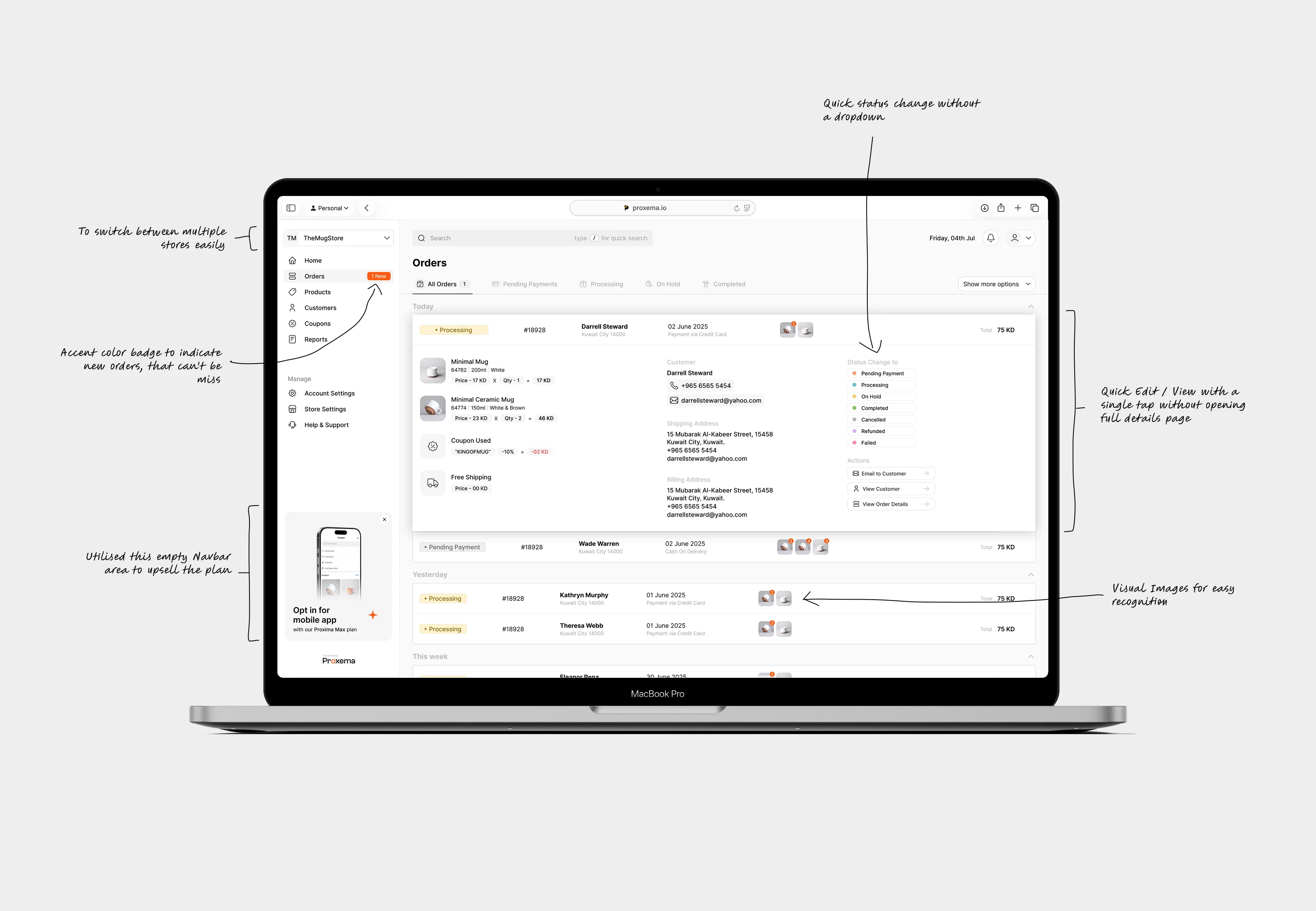
Design decisions behind order management
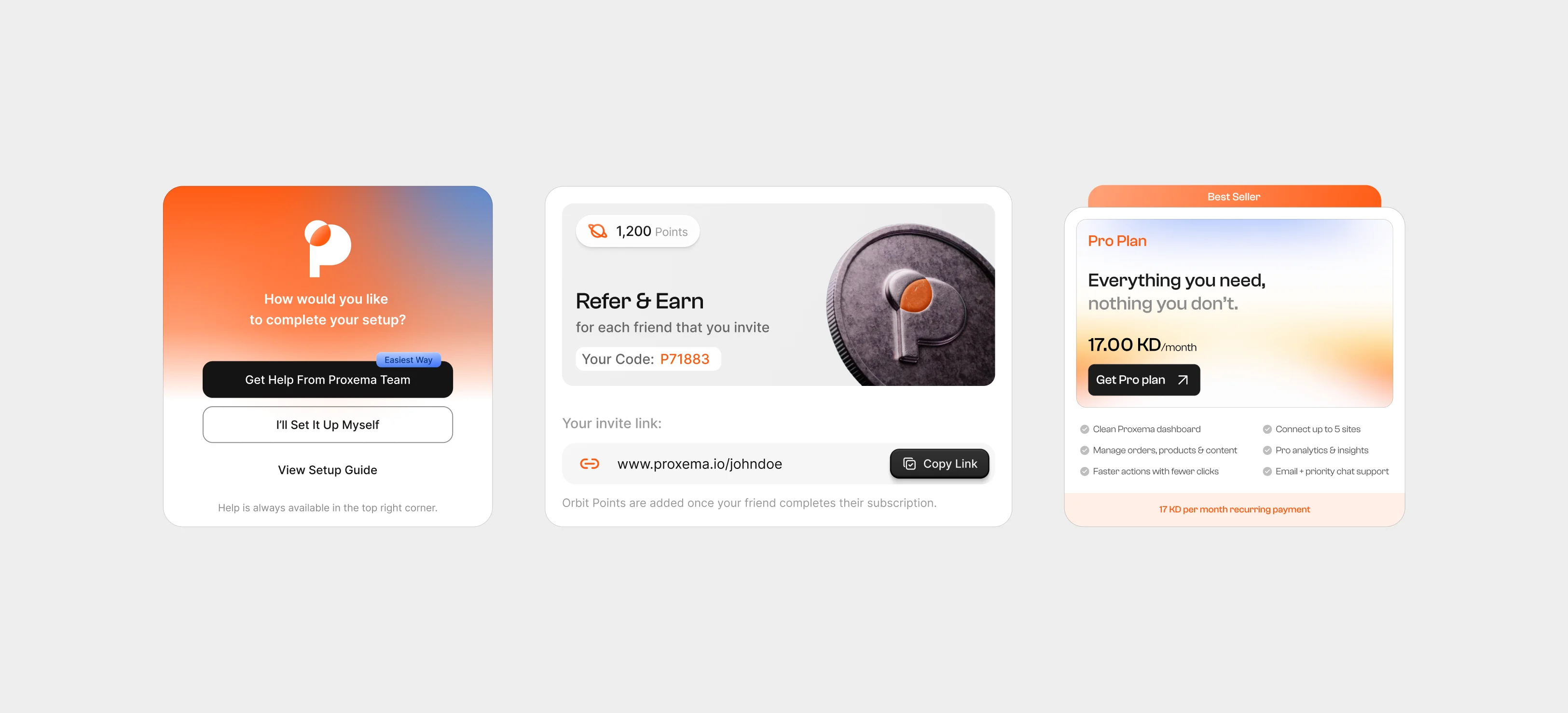
Supporting product experiences
Mobile
Moving Proxema to mobile created a different problem. Desktop gives us enough space for persistent navigation, tables, multiple columns and contextual controls. On a phone, trying to preserve that same structure would make the experience dense and difficult to operate.
So instead of treating mobile as a smaller desktop layout, I reconsidered the hierarchy around shorter, more focused tasks.
Information was reorganized into easier-to-scan views, secondary details were progressively revealed, and interactions were adapted for touch. This allowed important tasks such as checking orders, reviewing details and updating statuses to remain practical away from the desktop.
The goal was not feature-for-feature visual parity. It was functional continuity across devices.
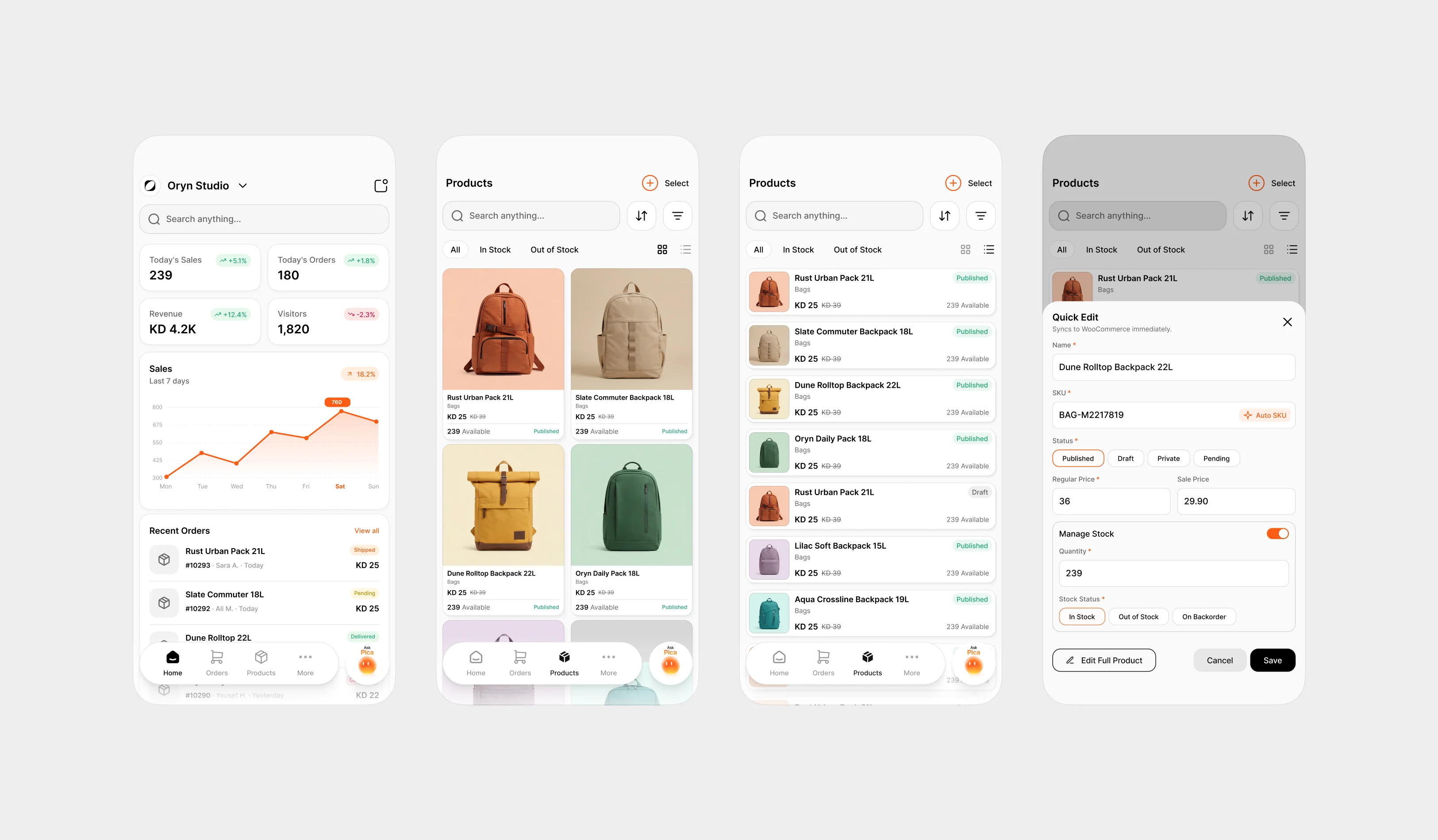
Proxema mobile app experience
REFLECTION
What I took away.
Proxema taught me that simplifying a complex product isn't about removing functionality. It's about deciding what users need at each moment and making everything else available without letting it get in the way.
That thinking shaped everything from information-heavy order management to adapting the experience for mobile and designing smaller touchpoints around the product. Each presented a different constraint, but the goal remained the same: make powerful functionality feel clear, familiar and manageable.
Working on Proxema also pushed me to think beyond individual screens. I started looking more closely at how interactions, patterns and visual hierarchy work together to make an entire product feel consistent.
The biggest lesson was simple: complexity can stay in the system. It doesn't have to reach the user.
